발행: 2023-05-05수정: 2026-06-10
파일구조
파일은 meta와 story로 이루어져있습니다
스토리북 CSF3 format
meta
const meta = {
  title: 'Components/ThemeCard',
  component: ThemeCard,
} satisfies Meta<typeof ThemeCard>
export default meta
story
type Story = StoryObj<typeof ThemeCard>
export const Primary = {
  args: {
    pathName: '',
    holder: 'aa',
    desc: 'aaaa',
  },
  //args에 들어갈 타입을 지정ㅏㄹ 수 있습니다
  argTypes: {
    pathName: { control: 'color' },
  },
  //자동으로 Document를 생성합니다
  tags: ['autodocs'],
  //Decorator는 Wrapper와 같은 역할을 합니다
  decorators: [
    (Story: any) => (
      <div className="w-96">
        <Story />
      </div>
    ),
  ],
} satisfies Story
story variable 같이 사용하기
export const Primary: Story = {
  args: {
    primary: true,
    label: 'Button',
  },
};

export const PrimaryLongName: Story = {
  args: {
    ...Primary.args,
    label: 'Primary with a really long name',
  },
};
arg
global하게 사용하기
const preview: Preview = {
  argTypes: {
  	theme: { control: 'select', options: ['light', 'dark'] }
  },
  args: { theme: 'light' },
};
argsType
meta, story 둘다 적용 가능
선택
variant: {
  options: ['primary', 'secondary'],
  control: { type: 'radio' },
},
  argTypes: {
    currentMenu: { control: 'select', options: MAIN_MENU.map((it) => it.name) },
  },
color
variant: { control: 'color' },
storybook에서 regex로 적용하기
// .storybook/preview.ts
const preview: Preview = {
  parameters: {
    controls: {
      matchers: {
        color: /(background|color)$/i,
        date: /Date$/,
      },
    },
  },
};
parameters
background
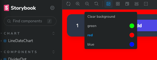
상단에서 배경선택이 가능합니다
  parameters: {
    backgrounds: {
      values: [
        { name: 'green', value: '#0f0' },
        { name: 'red', value: '#f00' },
        { name: 'blue', value: '#00f' },
      ],
    },
  }
mdx파일 사용하기
기존의 스토리 파일을 이용해서 mdx document를 생성할 수 있습니다
{/* ButtonDocs.mdx */}

import { Meta, Primary, Controls, Story } from '@storybook/blocks';
import * as ButtonStories from './Button.stories';

<Meta of={ButtonStories} />

# Button

A button is ...

<Primary />

## Props

<Controls />

## Stories

### Primary

A button can be of primary importance.

<Story of={ButtonStories.Primary} />

A button can be of secondary importance.

<Story of={ButtonStories.Secondary} />

{/* ... */}
토픽: Storybook
영역: 영역/개발
타입: 타입/로그